Add Live Chat to Your Website
Your website visitors have questions—and they don't want to hunt for a contact form. The Converge chat widget brings the conversation to them, appearing as a friendly chat button on every page. In this guide, you'll install it, make it match your brand, and start capturing leads automatically.
What You'll Need
Admin or Owner Access
Turning the widget on lives under Platforms, which only admins and owners can open. Widget Settings itself has no role gate, so any teammate can edit the copy, colors and suggested messages once the widget is live.
Access to Your Website's HTML
You'll need to add a script tag to your website. If you use a CMS like WordPress, Shopify, or Webflow, you can typically do this through their settings.
Your Website's Domain
One domain, written bare: example.com, with no https://, path or port. Converge accepts widget traffic from that hostname and any subdomain of it, and rejects everything else.
Enabling the Widget Integration
Admin / Owner OnlyBefore you can customize or install the widget, an admin needs to turn it on and register your website's domain. The widget is listed as a platform alongside WhatsApp and Telegram, because that is what it is: a channel that happens to run on your own site.
-
1
Click Platforms in the sidebar
The platform gallery opens, split into your connected channels, what's available, and what's coming soon. Agents don't see this page.
-
2
Open the card named "Widget"
It starts under Available. This is your own branded chat widget — the embeddable chat that runs on your website.
-
3
Enter your domain
Bare hostname only —
mycompany.com, nothttps://mycompany.com/shop. The Enable button stays greyed out until the value passes that check. -
4
Click Enable
Converge generates a unique API key and the page switches to its connected state, with the domain locked and the embed settings revealed.
-
5
Pick an embed method, then copy the Script Tag
Standard suits most sites. Inline Loader is the fallback when a cookie consent plugin blocks the standard tag, and the two Google Tag Manager options emit GTM-shaped snippets. With Standard you can also name your consent plugin (Cookiebot, CookieYes, CookieScript or WPConsent) so it classes the widget as necessary instead of blocking it. The copy button puts the finished snippet, API key included, on your clipboard.
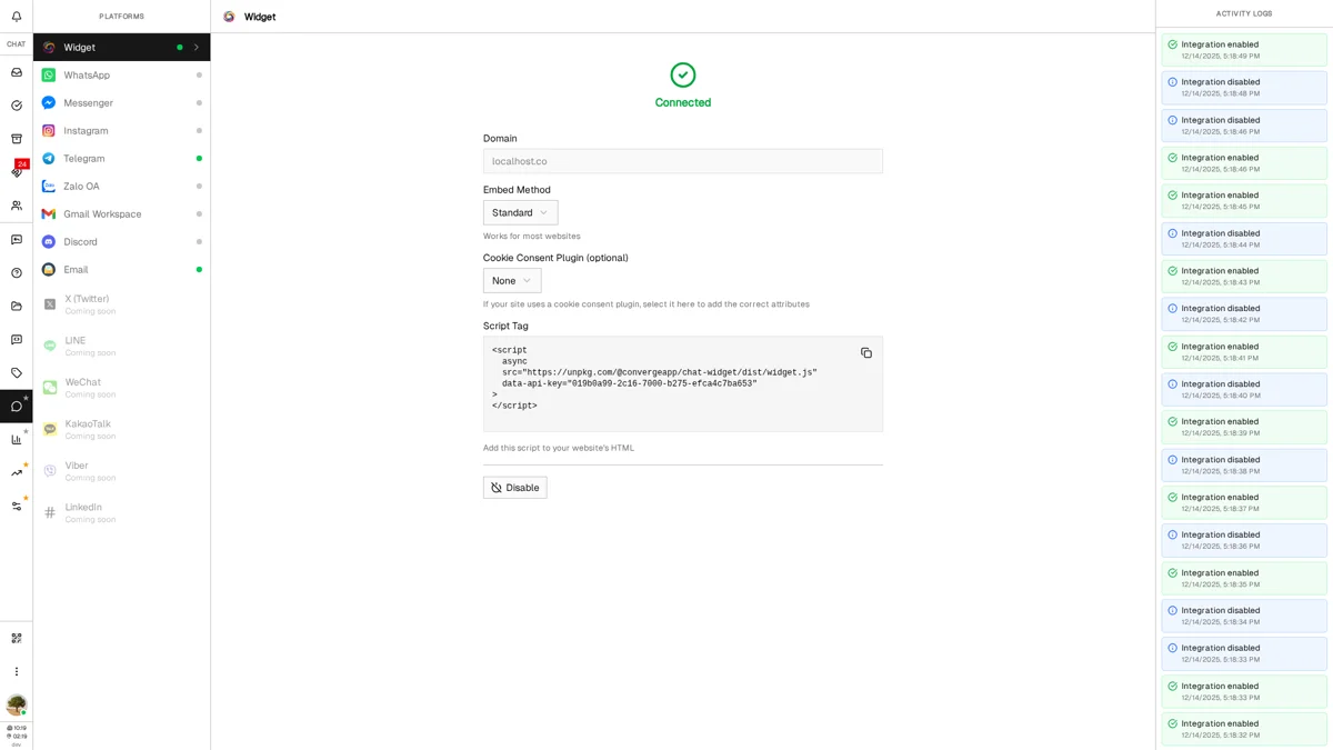
The Platforms Guide covers the embed methods and the consent-plugin attributes in more detail.
Installing on Your Website
Installation is one script tag. It loads asynchronously, so it never blocks your page, and it renders inside a shadow DOM — your site's CSS can't reach into the widget, and the widget's styles can't leak out onto your page.
The embed code
The Standard snippet looks like this, with your own key in place of YOUR_API_KEY:
<script async src="https://useconverge.app/widget.js" data-api-key="YOUR_API_KEY"></script>
Where to paste it
-
1
Open the template that loads on every page
Usually the site-wide layout:
index.html,layout.html, a base template, or your CMS's custom-code box. -
2
Paste the snippet in <head> or just before </body>
Either works. The tag is
asyncand the widget waits for the page body before mounting, so placement only changes how early the request starts. -
3
Save and deploy
Publish your changes. The widget appears on the next page load.
Platform-specific instructions
WordPress
Use a plugin like "Insert Headers and Footers" or add the code to your theme's footer.php file.
Shopify
Install the Converge app from the Shopify App Store — no code editing. Then in Theme EditorApp embeds, toggle on Converge Chat and paste your API key: that field starts empty, and the widget will not load until you fill it. The Shopify Connector Guide covers the rest of the install.
Webflow
Go to Project SettingsCustom CodePaste in the "Footer Code" section.
Wix
Go to SettingsCustom CodeAdd CodePaste and set placement to "Body - end".
Google Tag Manager
Switch the embed method to "Google Tag Manager (simple)" and paste the generated snippet into a Custom HTML tag firing on All Pages. The two-tag variant needs tag sequencing so the config tag fires first.
Opening the widget from your own button
The script exposes a small JavaScript API, so a "Talk to us" link anywhere on your page can open the chat instead of relying on the floating button:
window.ConvergeChat.open() // and window.ConvergeChat.close()
Customizing Appearance
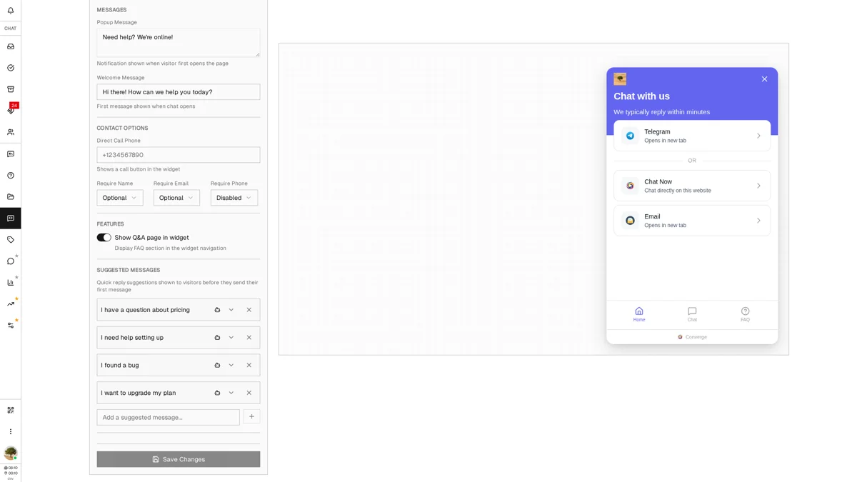
Your widget should feel like a natural part of your website, not an afterthought. Widget Settings is a form with a live preview beside it, so you can see every change before anyone else does.
Accessing widget settings
-
1
Open MoreWidget in the sidebar
"Widget" sits in the collapsed More group near the bottom of the sidebar, not among the top-level icons.
-
2
Work through the form on the left
Sections run in order: Content, Colors, Shape, Platforms, Messages, Contact Options, Features, Suggested Messages. The panel on the right is a working widget that re-renders as you type.
Content, colors and shape
- Content — Title (up to 100 characters) and subtitle (200) for the widget's home screen, plus an optional header image with an opacity slider once one is uploaded.
- Colors — Brand, Title and Background. Brand color paints the chat header, the home banner, primary buttons and the visitor's own message bubbles; the launcher stays a white circle with a brand-colored icon. Title color is the text sitting on top of the brand-colored header.
- Shape — Corner radius for the widget panel, corner radius for its buttons, and the icon shown on the launcher.
Each color field takes a hex code directly (#2c2ce5) or a pick from the palette.
Saving
Save Changes sits at the bottom of the form and stays disabled until something actually changes. The preview updates instantly, but your live site keeps serving the old configuration until you save — and visitors already on the page pick it up on their next load.
Q&A page visibility
The Features section holds one toggle: "Show Q&A page in widget". Turn it on and visitors get a FAQ tab in the widget's bottom navigation, with search. An editable Q&A list also appears below the builder on this same page, so you can create, edit and delete entries without leaving Widget Settings. Leave it off until you have content — an empty FAQ tab is worse than no tab.
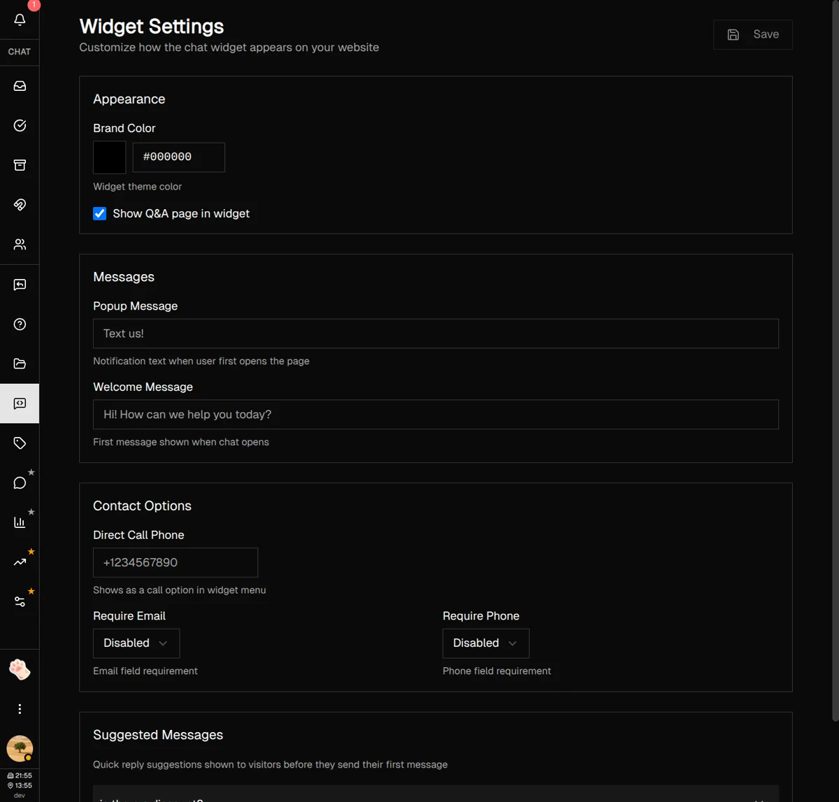
Choosing Which Channels Appear
The widget is not only a chat box. Its home screen lists every channel you have connected, so a visitor who would rather message you on WhatsApp or Telegram can do that in one tap instead of hunting for the link in your footer. The Platforms section of Widget Settings controls that list.
- Toggle each channel — Every platform you have connected gets a row with a switch. Turning it off hides it from the widget without touching the integration itself.
- Integration or Custom link — By default each row uses the link from its integration. Switch to Custom to point it somewhere else, like a WhatsApp click-to-chat URL with a pre-filled message.
- Drag to reorder — Grab the handle on the left of a row. The order here is the order visitors see, so put the channel your team answers fastest at the top.
- Platform Layout — Auto switches to a grid once you have several channels, or force List (one per row, roomier labels) or Grid (compact tiles).
The widget's own live chat appears in this list as Chat Now. Leave it on unless you want the widget to act purely as a channel launcher.
These changes save on their own. Toggling a channel, editing a custom link, or dragging a row saves immediately — you do not need to press Save Changes. Everything else in the form does.
Setting Up Messages
First impressions matter. The right messages can turn a passive visitor into an active conversation.
Popup message
This small bubble appears next to the launcher about three seconds after someone lands on your page. It's a gentle nudge to start a conversation — visitors can dismiss it with the X, and it stays gone for the rest of their browsing session and never returns once they have opened the widget.
Example: "👋 Hey! Got questions? We're here to help."
- Keep it under 50 characters—short and friendly works best (the field accepts up to 200)
- Leave empty to disable the popup entirely
Welcome message
When someone opens the chat, they see this message first. It sets the tone for the entire conversation and appears as a message from your team rather than from any named agent. Up to 500 characters.
Example: "Hi there! 👋 How can we help you today? Our team typically responds within a few minutes."
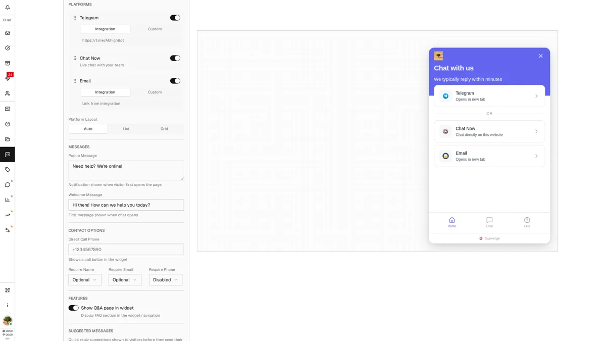
Configuring Lead Capture
Before visitors send their first message, you can collect their contact information. This turns anonymous website visitors into identifiable leads your team can follow up with. Everything here lives in the Contact Options section, below Messages.
Direct call phone
The same section holds a phone number field. Fill it in and the widget's home screen gains a call banner — useful for urgent enquiries or customers who would rather talk. Leave it empty and no banner appears.
Format: Use international format with country code (e.g., +1234567890)
What you can collect
| Field | Options | When to Use |
|---|---|---|
| Name | Disabled / Optional / Required | Addressing people by name; conversation lists read better |
| Disabled / Optional / Required | Lead generation, follow-up campaigns | |
| Phone | Disabled / Optional / Required | Sales calls, urgent support callbacks |
Setting requirements
All three fields start as Disabled, so a fresh widget asks visitors for nothing at all. Each has the same three-way control:
- Disabled — never asked for
- Optional — asked for, with a "Skip this step" link
- Required — the visitor cannot continue without it
How it works for visitors: When someone opens the chat, a "Before we start" card covers it and asks for one field at a time, with progress dots underneath. The last step's button reads Start Chat. It is asked once — the widget remembers the answers in that visitor's browser and goes straight to the conversation next time.
Adding Suggested Messages
Some visitors don't know what to say. Suggested messages give them pre-written conversation starters they can tap to begin chatting—no typing required. They appear as a scrollable row above the message box, and only until the visitor sends their first message.
Creating suggestions
-
1
Scroll to Suggested Messages
This section is at the bottom of Widget Settings.
-
2
Type your first suggestion
Think about what your visitors commonly ask. Examples: "I have a question about pricing" or "I need help with my order".
-
3
Click the + button or press Enter
The suggestion is saved right away — this list does not wait for Save Changes. Up to 200 characters each.
-
4
Add 3-5 suggestions
Cover your most common inquiry types. Too many can overwhelm; too few limits options.
Good suggestion examples
Answering a suggestion automatically
Each suggestion can carry its own canned answer. Click the chevron on the right of a row, type the reply (up to 500 characters) and hit Save. Rows with an auto-response get a small bot icon, and Remove clears it again.
When a visitor taps that suggestion, Converge posts the answer about two seconds later, prefixed with 🤖, and skips your usual auto-reply for that message. The conversation still lands in the inbox, so an agent can pick it up — the canned answer only covers the first minute. Use it for the questions with one stable answer ("Where do you ship?"), not for anything that depends on the customer.
Managing suggestions
- Delete: Click the X button next to any suggestion. It disappears from the widget immediately.
- Order: Suggestions show in the order you created them, and there is no drag handle here — to move one up, delete it and add it again.
Best Practices & Tips
Match your brand colors
Use your website's primary accent color for the widget. Consistency builds trust and makes the chat feel native to your site.
Keep the popup message short
Under 50 characters is ideal. Something like "Need help? 👋" works better than a paragraph.
Only show Q&A if you have content
An empty FAQ section creates a poor impression. Keep the toggle off until you've added at least 3-5 Q&A entries in the panel below it.
Require email for lead generation
Even if phone is optional, requiring email gives you a reliable follow-up channel for every conversation.
Write suggestions that match real questions
Look at your support inbox—what do customers actually ask? Mirror that language in your suggestions.
Decide who answers first
If the AI first responder is on, the widget is one of the channels it covers by default, so visitors get a grounded answer within seconds and your team inherits the conversation only when it escalates. If you would rather keep humans first, use an auto-reply as an acknowledgement or away message instead.
Ban abusive visitors when needed
If you encounter spam or harassment, right-click the visitor in the contact list and choose Ban — the same option sits in the "…" menu of the conversation header. Banned visitors see a blocked message and can't send new ones.
What's Next?
Your widget is installed and configured. Here are some related features to explore:
- Replies Guide — Set up quick replies and auto-replies for faster responses
- Q&A Guide — Create FAQ content that appears in your widget
- Analytics Guide — See which pages visitors browsed before they messaged you
- Platforms Guide — Connect WhatsApp, Telegram and the rest so they show up in the widget
Need more help?
Our support team is here for you. Click the chat widget in the bottom right corner to start a conversation.
We typically respond within minutes during business hours.